Tuesday 20 December 2016

Insitution Logos

I have researched different institution logos to inspire me for my own logo design:

Image result for warner bros logoImage result for warner bros logo

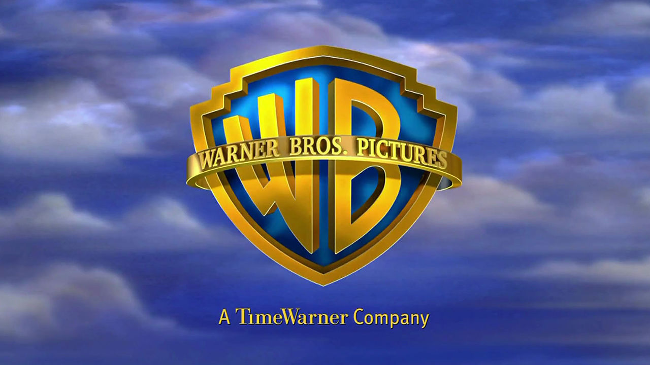
Warner Bros is an American entertainment company. It is a conglomerate and owns a various number of subsidiaries such as new line cinema and DC Entertainment. There are many different variations of the logo depending on the genre of film, however, the main logo has the colour scheme of blue and gold. As illustrated above, for one of their horror films, the logo has been altered with the colour scheme of black and grey. This immediately sets off the tone and shows what type of film it is going to be.

Image result for universal

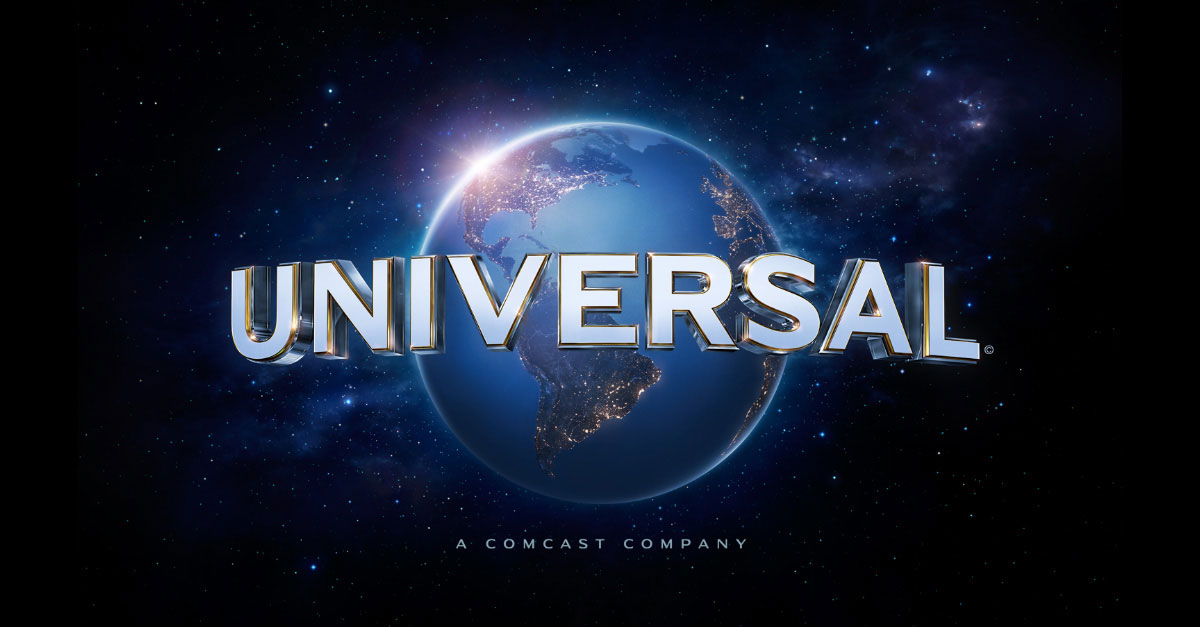
Another institution well known for producing horror films is Universal which is an American film company. Their logo is of an image of Earth from space to suit it's name. Unlike Warner Bros, the logo remains the same in all their horror films.

Image result for lionsgate logoImage result for lionsgate horror

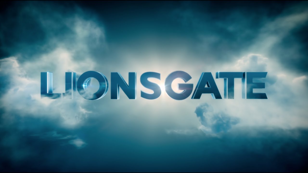
In contrast to Warner Bros, Lionsgate only has one other variation of their logo specifically for horror films. The colour scheme is red and black which, as mentioned before, represent danger. They are a well known institution for producing the franchise Saw.

Image result for dark castle entertainment

A production company which is dedicated to only horror films is Dark Castle Entertainment which is an American film company. The colours clearly show what genre of films that they produce.

I have decided that I want my company to produce not just films of the horror genre. Similar to Lionsgate, I will design a logo that suits all the genres, and then change the colour scheme to match our horror film. Therefore, I will design my logo based on the research that I have learnt about institution logos so far and apply it to my own design.

The different designs

As IMCM productions is a British film company, I have decided that the logo would include landmarks in London.


 Out of all three designs, I particularly liked the second one. I will continue to develop the second design and begin to add colours and animation to it.

The Process

First I designed the logo using Serif Draw.


After, I added in the background colours and details. This was meant to be the main logo for IMCM Productions. I chose the colour blue because it will appeal to both genders.


The main logo was then altered to match the horror genre for the main brief. The background colour was changed to red because the colour red is typical within a horror film.


The Final Design

Wednesday 7 December 2016

Target Audience Profiles

I asked a few people about their life and what are their favourite things to gain a better insight on my target audience's personalities. 


YouGov Profiles

I researched another horror movie in the genre paranormal to see the majority target market and their characteristics. I could use this information and apply it to my own horror film opening to ensure it meets the audiences expectation and attracts the chosen target market.To do this, I used a website called YouGov. It shows the background data of the consumers of each product.

A sample of 136 people enjoyed the film Insidious. I chose insidious because it is also a paranormal horror. As I want my horror film to appeal to a similar target market, I researched the demographic profiles, their personality and what they like for entertainment. 


The results where of what I expected. The age group for the film 'Insidious' was aged 18-24. This is within our horror films chosen target market of 12-25, so this gives us confidence that it will appeal to a much larger audience. However, the fact that the majority gender was female was unexpected because stereo-typically males enjoy horror films more. Fortunately, this is quite positive because it demonstrates that horror films can appeal to both genders equally and will extend the audience.
 Many people described themselves as interesting and imaginative. To suit this particular personality, the horror film will have and jump scares to increase interest. Looking at their favourite movies, the majority of them are horror films. There are several films that are paranormal and this ensures that we have made the right decision on deciding what genre to pick.

Tuesday 6 December 2016

Post-production: Sound Effects and Background Music

For the majority of background music, we have chosen a track from imcomptech.com called 'Giant Wryn'. The instruments used was Piano, Synths and Brass. These instruments gave off an eerie, dark and unnerving feel to it which created an atmosphere of being on edge. We felt that this piece was appropriate and used it during the scenes which were shot outside.


Using YouTube to MP3 converter we found different sound effects to use:


We have decided to replace the whispering voice near the end because it did not seem very scary. The audio file was also too quite so the audience couldn't hear it. Therefore, we decided to have the diegetic sound of a knife drawing to hint that something bad is going to happen. Before anything is shown, the audience would just hear the sound effect, and then the screen would turn black to create a cliff hanger.


We cut the clip shorter, to be used a diegetic sound effects. This gives the protagonist and the audience a sense that someone is in the garden.


The footsteps could also not be heard so we changed it to a glass bottle smashing. This is so that it would seem that the protagonist has taken off her earphones because the noise had caught her attention.

Monday 5 December 2016

Post-production: Sound

Here is the list of sound effects I will need for the main brief.

-Rustling Leaves
-Whispering Voices
-Police Car Sirens

To look for suitable background music, I went onto YouTube to look for copyright free music. Once I found the ones I wanted, I copied the URL link into an online mp3 converter to change it into an audio file. Once it was imported into WeVideo, I then edited it by changing the volume and cutting out the parts I did not want.

I also got music from a copyright free website called Imcompetech and downloaded it onto the computer. I found that there was a wide range of different music to suit the genre of horror.


Post-production: Adding in the Credits


As the font we wanted wasn't available in Wevideo, we had to save each title as an image and used Photoshop to crop out the background. To do this, I used the magic wand tool. After the background was removed, I imported it into Wevideo and  placed it on top of the clips to where I wanted it to be.


Another problem that I found was that that Wevideo, was that the title could not be titled. For this, I had to print screen the scene that I wanted the credits to fit into and place it in Microsoft Word. I inserted the already Photoshopped title into Word as well and titled it so it fitted the scene. Afterwards, I drew a black box behind the text and grouped it as one picture. I then saved that image and used Photoshop again to cut out the background. The title was now titled and I positioned it in Wevideo to how I wanted it to be.


We planned to spend at least 3 days to do the credits. The time took to actually do the credits spread out across two days, each in two hour sessions. This is because we planned each step carefully and split the role role between us to save time. Therefore, we finished quicker than expected, leaving us more time to edit other parts of the main brief. I felt that we have managed our time well for doing all the credits.

Post-production: Editing the clips


To begin with, me and Izzy put all the clips together in timeline mode until we are satisfied. One of the clips, however, broke the 180° rule which made the clip transition look disorientating. Fortunately, this problem was easily solved by flipping the clip around. 

Another thing that we wanted to change was the phone call clip in the beginning. Me and Izzy have decided that we did not to show the antagonist right at the beginning so we covered it up with a black screen and left the voice behind it. We plan to place credits on top afterwards.

The animation for the logo was imported into we video and was place at the beginning. To get the logo for Lionsgate, I went onto Youtube to look for a clip and then converted it into and mp4 file which was also imported into Wevideo. I placed it after my own logo.

Our time management was quite well as we finished editing the clips together quite quickly. We also found that the clips fit well so we didn't need to re-film anything.